library(here)
library(ggplot2)
library(showtext)
library(sysfonts)
library(tidyverse)
library(readxl)
library(ggimage)

# Set base directory
base_dir <- here::here()

# Load custom font
font_add("gg", regular = "assets/optiamadeus-solid.otf")

showtext_auto()This post covers creating custom ggplot themes inspired by Gilmore Girls, extracting color palettes from show imagery, and visualizing Netflix engagement data.
NoteThings I played around with here!
- Gilmore Girls Network Data — additional fan-created datasets
- eyedroppeR package — extract color palettes from images
- showtext package — use custom fonts in R graphics
Setup
Creating a Gilmore Girls Theme
Color Palettes
First, let’s define color palettes inspired by the show’s aesthetic:
# Main Gilmore Girls palette
gg_pal <- c(
"#a1dce2", "#02365b", "#31a590", "#d0eeee", "#3eb4d2",
"#4E889D", "#2D637B", "#0077b6", "#0096c7", "#00b4d8",
"#48cae4", "#90e0ef", "#ADE8f4", "#caf0f8", "#8791A8", "#292F3A"
)

# Season-specific palettes
s1_palette <- c("#DF6D3B", "#F3A749", "#F5C371", "#F5D9AC")
s2_palette <- c("#125072", "#4C98A7", "#8DCBD2", "#CAE4E6")
s3_palette <- c("#4D306D", "#7F629B", "#BB9DC6", "#E2D0DD")
s4_palette <- c("#C1DAB9", "#89B997", "#518E66", "#205D3D")
s5_palette <- c("#992058", "#AF526F", "#E6AAB4", "#F7CFDF")
s6_palette <- c("#0A2965", "#3F4F7A", "#6877A6", "#C7C8E0")
s7_palette <- c("#782B2E", "#D47A73", "#EDA098", "#F9C6C1")

# Dark/winter palette
drk_palette <- c(
"#101422", "#273F68", "#4E6F9F", "#6083B5", "#ACB6CD",
"#8791A8", "#6A738B", "#4B5976", "#3C4459", "#242D40"
)
Palette Function
A function to generate palettes for discrete or continuous scales:
gg_palette <- function(num_cols, var_type = c("discrete", "continuous")) {
type <- match.arg(var_type)

if (missing(num_cols)) {
 num_cols <- length(gg_pal)
}

pal <- switch(
 type,
 "discrete" = rep(gg_pal, length.out = num_cols),
 "continuous" = grDevices::colorRampPalette(gg_pal)(num_cols)
)

structure(
 pal,
 name = "gg",
 class = "palette"
)
}
Font Check Helper
font_urls <- data.frame(
name = c("Architects Daughter", "Shadows Into Light Two", "Kalam"),
url = c(
 "https://fonts.google.com/specimen/Architects+Daughter/",
 "https://fonts.google.com/specimen/Shadows+Into+Light+Two/",
 "https://fonts.google.com/specimen/Kalam/"
)
)

check_font <- function(font_name) {
if (!requireNamespace("extrafont", quietly = TRUE)) {
 warning(
   "The font \"", font_name, "\" may or may not be installed on your system. ",
   "Please install the package `extrafont` if you'd like me to check for you.",
   call. = FALSE
 )
} else {
 if (!font_name %in% extrafont::fonts()) {
   if (font_name %in% font_urls$name) {
     warning(
       "Font '", font_name, "' isn't in the extrafont font list (but it may still work). ",
       "If recently installed, try running `extrafont::font_import()`. ",
       "To install, visit: ", font_urls[font_urls$name == font_name, "url"],
       call. = FALSE
     )
   } else {
     warning(
       "Font '", font_name, "' isn't in the extrafont font list (but it may still work). ",
       "If recently installed, try running `extrafont::font_import()`.",
       call. = FALSE
     )
   }
 }
}
}
Custom Theme
theme_gg <- function(
 base_family = "gg",
 base_size = 10.5,
 with.panel.grid = FALSE,
 text.color = "#000",
 title.color = "#D81F26",
 axis.text.color = "#2D637B",
 plot.background.color = "#fff",
 axis.text.size = base_size * 3/4,
 subtitle.text.size = base_size * 1.25,
 title.text.size = base_size * 1.75,
 caption_family = base_family,
 caption_size = 11,
 caption_face = "plain",
 caption_margin = 14,
 axis_title_just = "rt",
 plot_margin = ggplot2::margin(30, 30, 30, 30),
 base_theme = ggplot2::theme_minimal()
) {
if (!is.null(base_family)) check_font(base_family)

base_theme +
 ggplot2::theme(
   text = ggplot2::element_text(
     family = base_family,
     size = base_size,
     color = text.color
   ),
   plot.background = ggplot2::element_rect(
     fill = plot.background.color,
     color = "#fff"
   ),
   panel.background = ggplot2::element_blank(),
   panel.grid = ggplot2::element_line(
     color = if (with.panel.grid) axis.text.color else "transparent",
     linetype = 1
   ),
   axis.text = ggplot2::element_text(
     color = axis.text.color,
     size = axis.text.size
   ),
   legend.background = ggplot2::element_rect(fill = "transparent", color = NA),
   legend.key = ggplot2::element_rect(fill = "transparent", color = NA),
   legend.text = ggplot2::element_text(color = "#f8f8f2"),
   legend.title = ggplot2::element_text(face = "bold", color = "#000"),
   title = ggplot2::element_text(
     family = "gg",
     color = title.color,
     size = title.text.size
   )
 )
}
Test the Custom Font
set.seed(123)
hist(
rnorm(1000),
breaks = 30,
col = "#4E889D",
border = "white",
main = "",
xlab = "",
ylab = ""
)
title("Hey look it is the Gilmore font!", family = "gg", cex.main = 2)
text(2, 70, "N = 1000", family = "gg", cex = 2.5)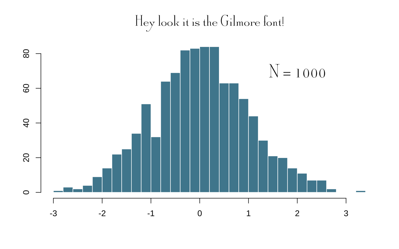
Extracting Color Palettes
Using the eyedroppeR package, we can create color palettes based on show imagery:
library(eyedroppeR)

# Extract colors from promotional images
path <- "https://media.glamour.com/photos/58280c860700a182135fdc61/master/w_2560%2Cc_limit/gilmore-girls-winter-alexis-bledel-lauren-graham-netflix-horizontal-2016.jpg"
extract_pal(10, path, label = "GG", sort = "auto")
Visualizing the Main Palette
cols <- c(
"#03045e", "#023e8a", "#0077b6", "#0096c7", "#00b4d8",
"#48cae4", "#90e0ef", "#ADE8f4", "#caf0f8"
) |>
fct_inorder()

tibble(x = 1:9, y = 1) |>
ggplot(aes(x, y, fill = cols)) +
geom_col(colour = "white") +
geom_label(
 aes(label = cols),
 nudge_y = -0.1,
 fill = "white",
 size = 3
) +
annotate(
 "label",
 x = 5, y = 0.5,
 label = "Gilmore Girls Colors",
 fill = "white",
 alpha = 0.8,
 size = 6,
 family = "gg"
) +
scale_fill_manual(values = as.character(cols)) +
theme_void() +
theme(legend.position = "none")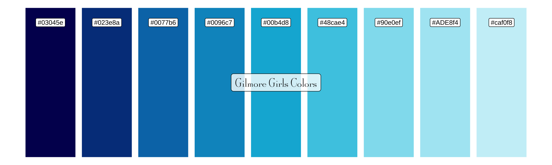
Fall Colors Palette
fall_cols <- c(
"#03071e", "#370617", "#6a040f", "#9d0208", "#d00000",
"#dc2f02", "#e85d04", "#f48c06", "#faa307", "#ffba08"
) |>
fct_inorder()

tibble(x = 1:10, y = 1) |>
ggplot(aes(x, y, fill = fall_cols)) +
geom_col(colour = "white") +
geom_label(
 aes(label = fall_cols),
 nudge_y = -0.1,
 fill = "white",
 size = 3
) +
annotate(
 "label",
 x = 5.5, y = 0.5,
 label = "Fall Colors",
 fill = "white",
 alpha = 0.8,
 size = 6,
 family = "gg"
) +
scale_fill_manual(values = as.character(fall_cols)) +
theme_void() +
theme(legend.position = "none")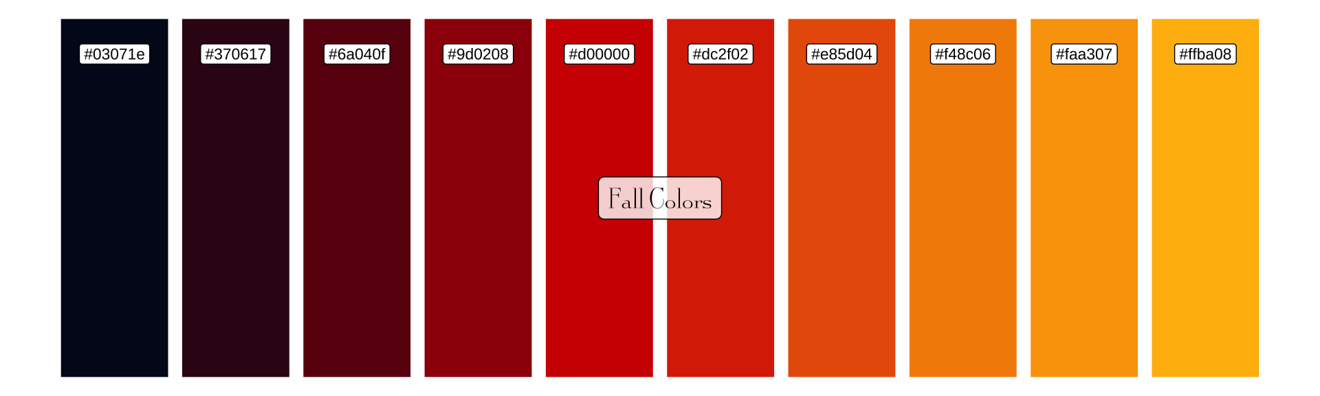
Netflix Viewing Data
Let’s analyze how much people watched Gilmore Girls on Netflix using their engagement report.
Load and Prepare Data
library(tinytable)
netflix_raw <- read_excel("What_We_Watched_A_Netflix_Engagement_Report_2023Jan-Jun.xlsx")
# Set column names
cols <- c("title", "yes", "date", "hours")
names(netflix_raw) <- cols
# Filter for Gilmore Girls and add season info
netflix_data <- netflix_raw |>
filter(str_detect(title, "Gilmore Girls")) |>
mutate(
# Convert hours to numeric (remove commas if present)
hours = as.numeric(gsub(",", "", hours)),
season = case_when(
grepl("1", title) ~ 1,
grepl("2", title) ~ 2,
grepl("3", title) ~ 3,
grepl("4", title) ~ 4,
grepl("5", title) ~ 5,
grepl("6", title) ~ 6,
grepl("7", title) ~ 7,
TRUE ~ 8
),
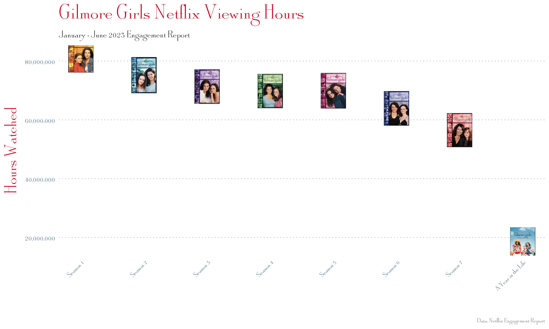
season_label = if_else(season == 8, "A Year in the Life", paste("Season", season)),
img = case_when(
season == 1 ~ "assets/S1.png",
season == 2 ~ "assets/S2.png",
season == 3 ~ "assets/S3.png",
season == 4 ~ "assets/S4.png",
season == 5 ~ "assets/S5.png",
season == 6 ~ "assets/S6.png",
season == 7 ~ "assets/S7.png",
season == 8 ~ "assets/AYITL.png"
)
)
netflix_data |>
select(title, season, hours) |>
tt(caption = "Gilmore Girls Netflix Viewing Hours (Jan-Jun 2023)") |>
format_tt(j = "hours", fn = scales::comma) |>
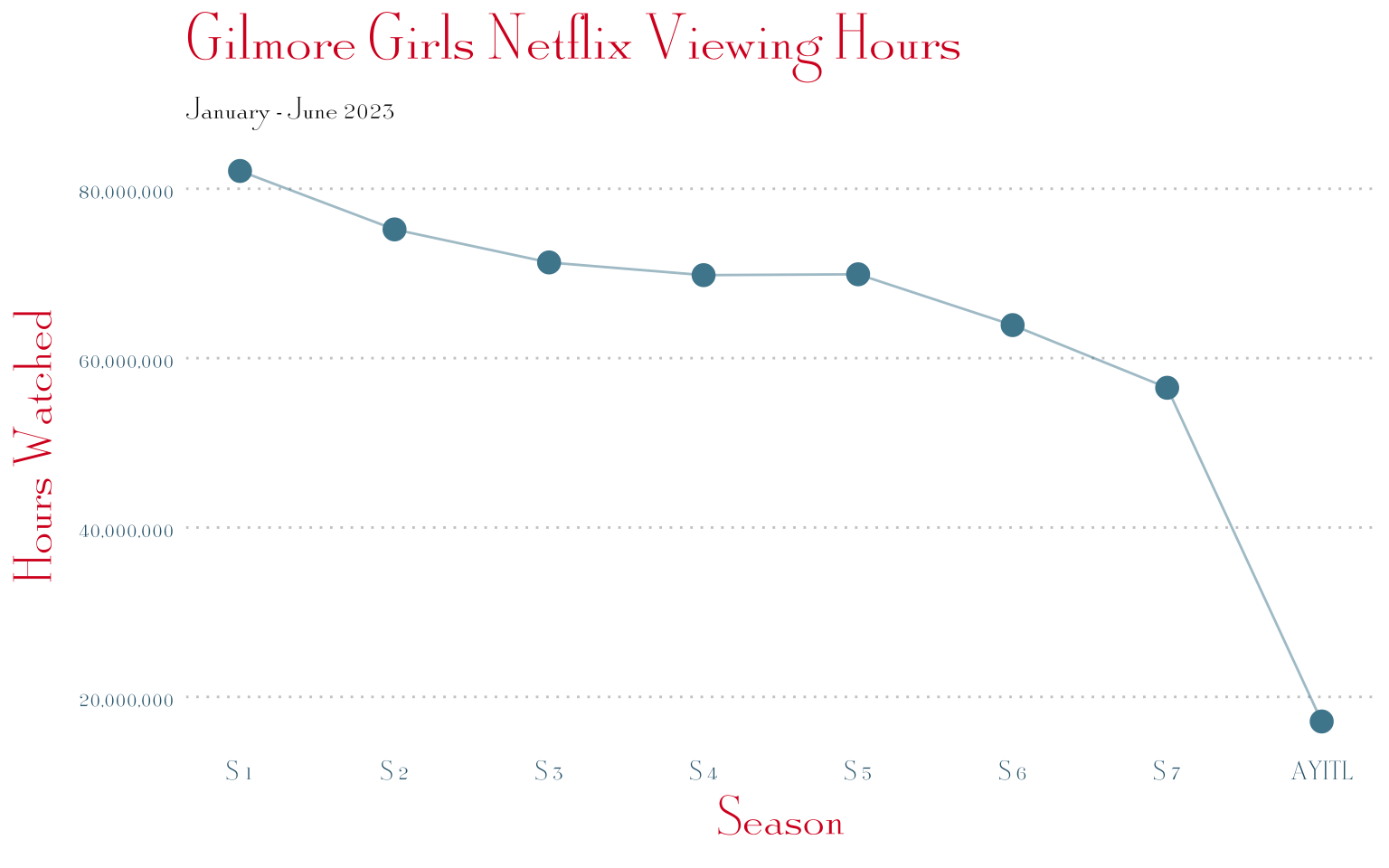
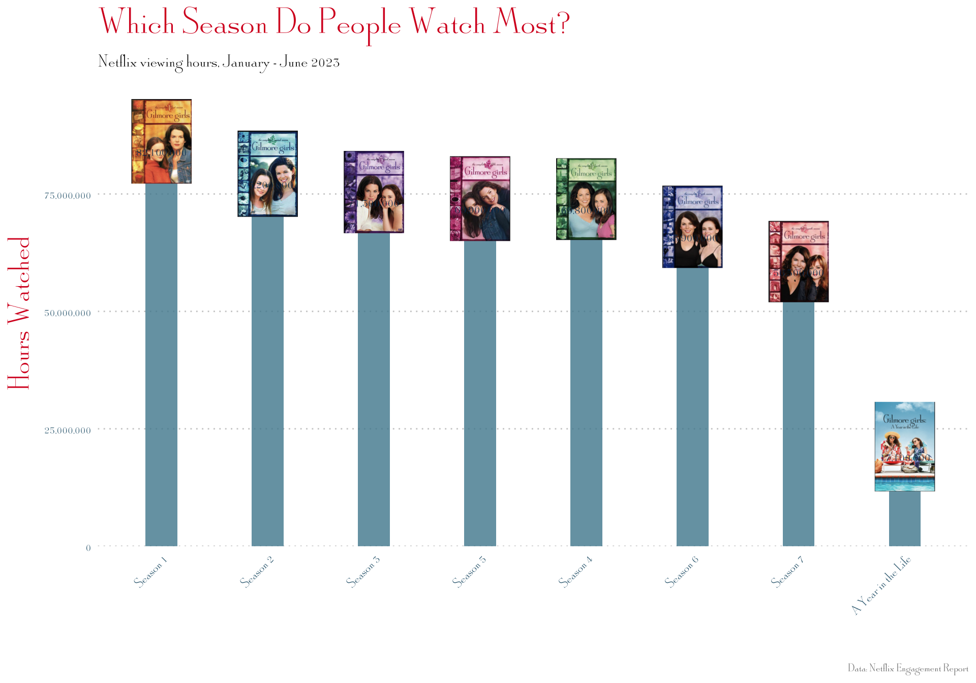
style_tt(bootstrap_class = "table table-striped table-hover")| title | season | hours |
|---|---|---|
| Gilmore Girls: Season 1 | 1 | 82,100,000 |
| Gilmore Girls: Season 2 | 2 | 75,200,000 |
| Gilmore Girls: Season 3 | 3 | 71,300,000 |
| Gilmore Girls: Season 5 | 5 | 69,900,000 |
| Gilmore Girls: Season 4 | 4 | 69,800,000 |
| Gilmore Girls: Season 6 | 6 | 63,900,000 |
| Gilmore Girls: Season 7 | 7 | 56,500,000 |
| Gilmore Girls: A Year in the Life: Limited Series | 8 | 17,100,000 |
Basic Plot
ggplot(netflix_data, aes(season, hours)) +
geom_point(size = 4, color = "#4E889D") +
geom_line(color = "#4E889D", alpha = 0.5) +
scale_x_continuous(breaks = 1:8, labels = c(paste("S", 1:7), "AYITL")) +
scale_y_continuous(labels = scales::comma) +
labs(
 title = "Gilmore Girls Netflix Viewing Hours",
 subtitle = "January - June 2023",
 x = "Season",
 y = "Hours Watched"
) +
theme_gg(base_size = 14) +
theme(
 panel.grid.major.y = element_line(color = "#ccc", linetype = "dotted"),
 axis.text = element_text(size = 12)
)
Adding Season Cover Images
Using geom_image() to replace points with season artwork:
netflix_data |>
ggplot(aes(season, hours)) +
geom_image(aes(image = img), size = 0.12) +
scale_x_continuous(
 breaks = 1:8,
 labels = c(paste("Season", 1:7), "A Year in the Life")
) +
scale_y_continuous(labels = scales::comma) +
labs(
 title = "Gilmore Girls Netflix Viewing Hours",
 subtitle = "January - June 2023 Engagement Report",
 x = "",
 y = "Hours Watched",
 caption = "Data: Netflix Engagement Report"
) +
theme_gg(base_size = 14) +
theme(
 panel.grid.major.y = element_line(color = "#ccc", linetype = "dotted"),
 axis.text.x = element_text(angle = 45, hjust = 1, size = 10),
 axis.text.y = element_text(size = 12),
 plot.caption = element_text(size = 9, color = "#666")
)
Bar Chart with Images
# Define aspect ratio
asp_ratio <- 1.618

netflix_data |>
ggplot(aes(x = reorder(season_label, -hours), y = hours)) +
geom_col(fill = "#4E889D", alpha = 0.8, width = 0.3) +
geom_image(
 aes(image = img, y = hours + max(hours) * 0.05),
 size = 0.08,
 asp = asp_ratio
) +
geom_text(
 aes(label = scales::comma(hours)),
 vjust = -0.5,
 size = 4,
 family = "gg",
 color = "#02365b"
) +
scale_y_continuous(
 labels = scales::comma,
 expand = expansion(mult = c(0, 0.15))
) +
labs(
 title = "Which Season Do People Watch Most?",
 subtitle = "Netflix viewing hours, January - June 2023",
 x = "",
 y = "Hours Watched",
 caption = "Data: Netflix Engagement Report"
) +
theme_gg(base_size = 14) +
theme(
 panel.grid.major.y = element_line(color = "#ccc", linetype = "dotted"),
 axis.text.x = element_text(angle = 45, hjust = 1, size = 11),
 plot.caption = element_text(size = 9, color = "#666")
)
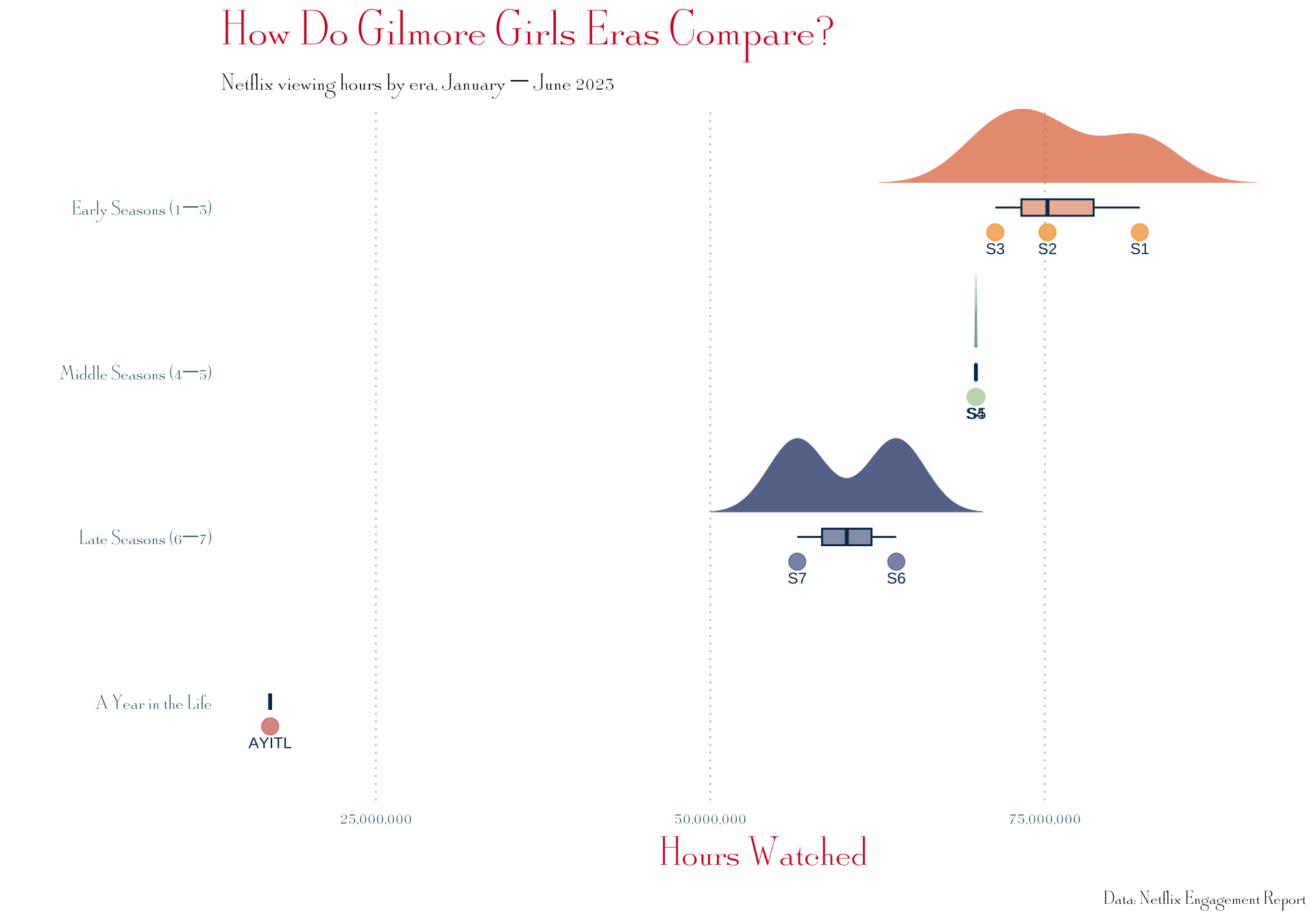
Making a raincloud plot?
devtools::source_gist("2a1bb0133ff568cbe28d",
                      filename = "geom_flat_violin.R")

netflix_data <- netflix_data |>
  mutate(
    era = case_when(
      season %in% 1:3 ~ "Early Seasons (1–3)",
      season %in% 4:5 ~ "Middle Seasons (4–5)",
      season %in% 6:7 ~ "Late Seasons (6–7)",
      season == 8     ~ "A Year in the Life"
    ),
    era = factor(era, levels = c(
      "A Year in the Life",
      "Late Seasons (6–7)",
      "Middle Seasons (4–5)",
      "Early Seasons (1–3)"
    ))
  )

# Define era colors using your season palettes
era_fills  <- c(
  "Early Seasons (1–3)"  = "#DF6D3B",
  "Middle Seasons (4–5)" = "#518E66",
  "Late Seasons (6–7)"   = "#0A2965",
  "A Year in the Life"   = "#782B2E"
)

era_points <- c(
  "Early Seasons (1–3)"  = "#F3A749",
  "Middle Seasons (4–5)" = "#C1DAB9",
  "Late Seasons (6–7)"   = "#6877A6",
  "A Year in the Life"   = "#D47A73"
)

netflix_data |>
  ggplot(aes(x = era, y = hours, fill = era)) +
  geom_flat_violin(
    position = position_nudge(x = 0.15),
    trim = FALSE,
    alpha = 0.7,
    scale = "width",
    color = NA
  ) +
  geom_boxplot(
    width = 0.1,
    outlier.shape = NA,
    alpha = 0.5,
    color = "#02365b"
  ) +
  geom_point(
    aes(color = era),
    position = position_nudge(x = -0.15),
    size = 4,
    alpha = 0.8
  ) +
  # Label each point with its season number
  geom_text(
    aes(label = if_else(season == 8, "AYITL", paste0("S", season))),
    position = position_nudge(x = -0.25),
    size = 3,
    family = "Architects Daughter",
    color = "#02365b"
  ) +
  scale_fill_manual(values = era_fills) +
  scale_color_manual(values = era_points) +
  scale_y_continuous(labels = scales::comma) +
  coord_flip() +
  labs(
    title = "How Do Gilmore Girls Eras Compare?",
    subtitle = "Netflix viewing hours by era, January – June 2023",
    x = "",
    y = "Hours Watched",
    caption = "Data: Netflix Engagement Report"
  ) +
  theme_gg(base_size = 14) +
  theme(
    legend.position = "none",
    panel.grid.major.x = element_line(color = "#ccc", linetype = "dotted"),
    axis.text = element_text(size = 12)
  )